Project 1: TUS Moodle UX/UI redesign
Discover my UX journey in redesigning TUS Moodle, focusing on user experience and interface improvements for students and lecturers. This project showcases my approach to complex challenges and innovative solutions.
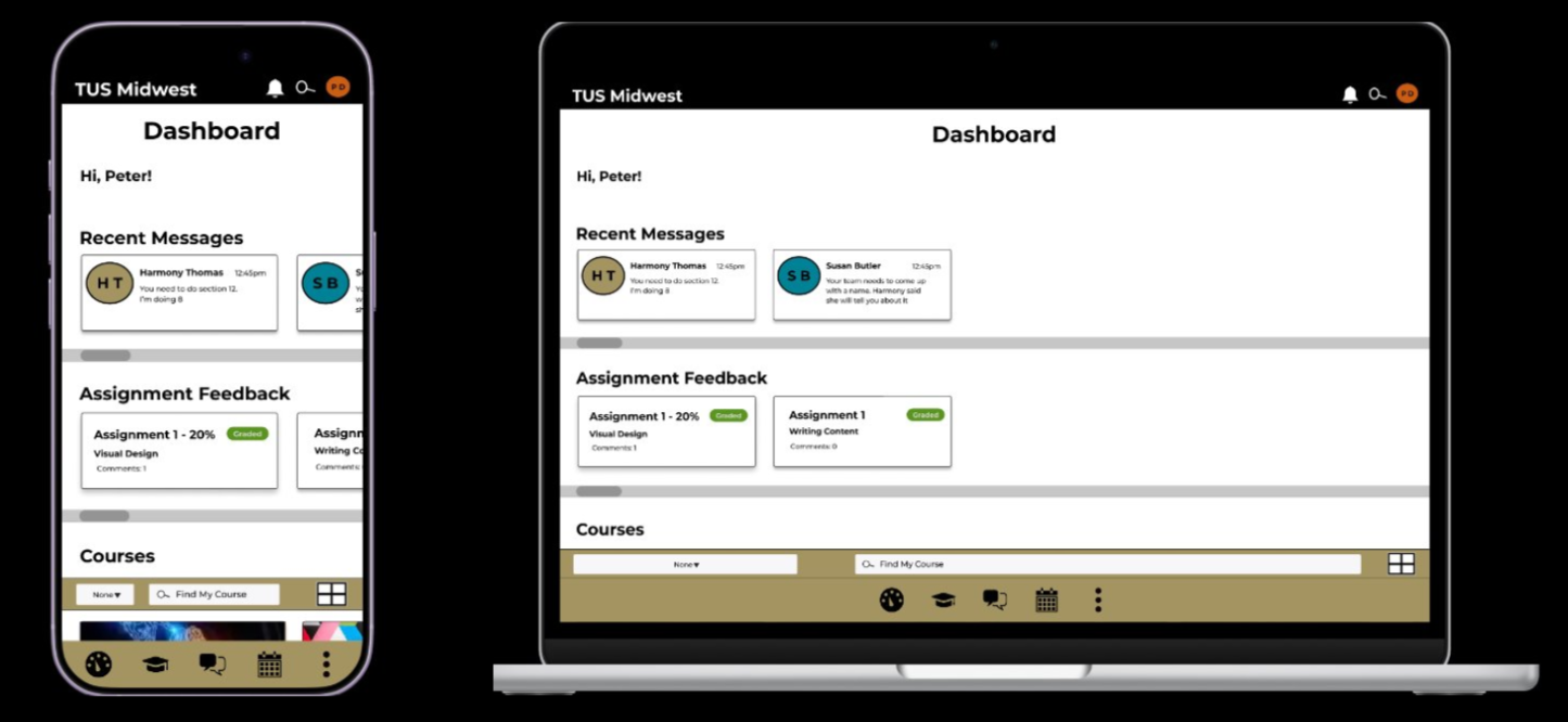
Final prototype on mobile and web view
Addressing the core challenge
The primary challenge in redesigning TUS Moodle was managing the project's scope within a four-month timeframe. While a full institutional app redesign was not feasible, the goal was to test how psychological frameworks like Cognitive Load Theory (CLT) and Transactional Stress Model (TSM) could reduce negative cognitive load. This aimed to present a better solution than the existing TUS Midwest Moodle for Clonmel students.
A crucial learning point was understanding when to adapt and reduce the scope, especially when faced with participant unavailability or resource limitations. This involved creating a responsive prototype that could still impress and inspire key stakeholders like lecturers and students, even when the project encountered hurdles.
Key changes and clever solutions
The main objective of the TUS Moodle redesign was to make the platform faster, clearer, and less stressful for both students and lecturers. Significant changes focused on reducing unnecessary steps, improving navigation, and eliminating sources of extraneous cognitive load.
One key change involved redesigning the dashboard to allow students quicker access to vital information, such as recent messages and assignment feedback, without having to navigate into individual module pages. The messaging system was also overhauled to resemble familiar messaging apps, featuring clearer previews, timestamps, and contact information, thereby reducing the need for users to learn a new communication pattern.
A consistent visual and structural system was established across the prototype, incorporating clearer hierarchy, stronger spacing, and accessible colour choices verified with WebAIM. Reusable Figma variables and mobile-first responsive layouts ensured the prototype worked seamlessly across mobile and other devices, enhancing usability and accessibility.
Video example of dashboard content preview and shortcuts
Evaluating the impact of the redesign
To assess the effectiveness of the TUS Moodle prototype redesign, I conducted recorded user testing and structured feedback analysis. Participants were informed that their feedback would be used for the project and reviewed by examiners, with strict anonymity maintained.
A relational database in Excel was created to organize the feedback, including participant aliases, timestamps, issue categories, participant quotes, cognitive load type, and Transactional Stress Model appraisal type. This allowed for tracking feedback without identifying participants, while linking comments to specific usability issues and prototype areas.
Pivot tables and charts were then used to compare feedback across testing rounds, enabling analysis of whether negative extraneous cognitive load was decreasing and if germane cognitive load was increasing. This systematic approach helped validate the improvements made to the Moodle prototype.
Between round 1 and round 2 of student user testing extraneous cognitive load decreased from 52% to 40%, which is a proportional decrease in negative cognitive load. Germane cognitive load increased from 44% to 58% between round 1 and round 2. The results show that the project moved in a direction indicating the redesign was improving the user experience for students.
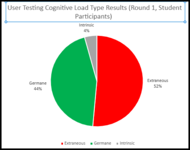
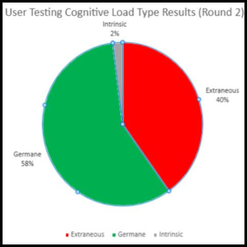
Project scope reduced to student user testing only. These charts reflect this. data taken from user testing rounds.
Key Design Decisions
- Accessible design system: I audited Moodle colours with WebAIM, adjusted failed contrast colours, and created reusable Figma variables for colour, spacing, layout, and breakpoints.
- Clearer visual hierarchy: I retained Montserrat for continuity, but used stronger type weights, spacing, and layout structure to make content easier to scan.
- Reduced navigation effort: I added dashboard shortcuts for recent messages and assignment feedback, helping students access key information without entering individual modules.
- Simplified communication: I redesigned messaging to follow familiar messaging app patterns, including previews, timestamps, and contact availability. .
- Responsive mobile-first structure: I designed layouts to scale between mobile and desktop views, supporting use across iPhone and MacBook screen sizes.
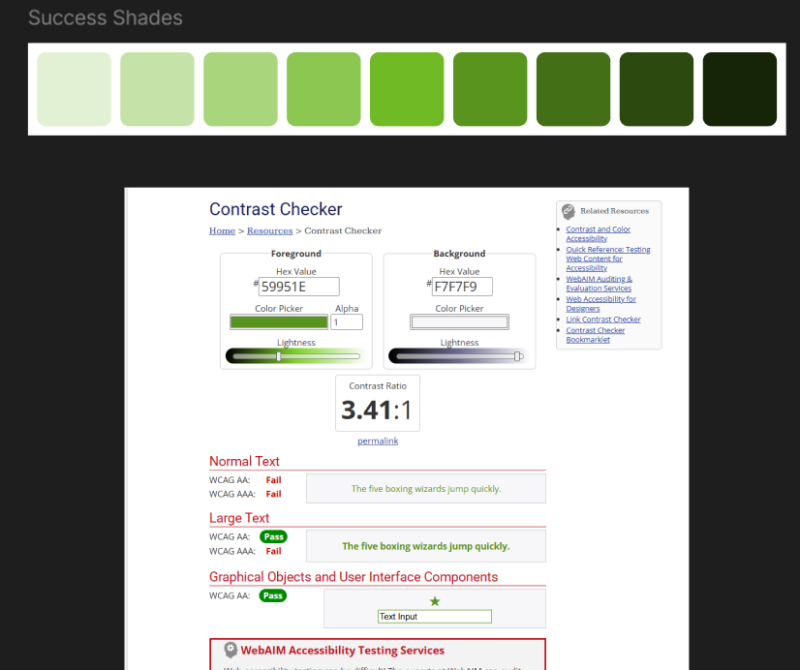
Design tokens audit

Shortcut to messaging page through dashboard carousel
Outcome / Reflection
The project originally aimed to redesign Moodle for both students and lecturers. As the scale of the work developed, the scope was refined to focus on a student-facing prototype, allowing for deeper research, iteration, and testing.
The final outcome was a 21-screen Version 3 Figma prototype, developed across three iterations and tested through two rounds of student user testing. Feedback was analyzed using Cognitive Load Theory and the Transactional Stress Model, with participant comments organized into an anonymous relational Excel database and evaluated through pivot tables and charts.
Testing showed that negative extraneous cognitive load decreased between rounds, while germane cognitive load increased. This suggested that the prototype became easier and less stressful to use as it developed. Students also responded positively to the final version, with some expressing that they wished the current Moodle interface worked more like the redesign.
This project strengthened my skills in self-directed UX research, project management, psychological framework application, feedback analysis, and high-fidelity prototyping.

All connected screens of the final student facing prototype