Project 2: SUSI Research & Redesign Project
See how I reimagined the SUSI student application experience, focusing on accessibility and inclusivity for disabled users.
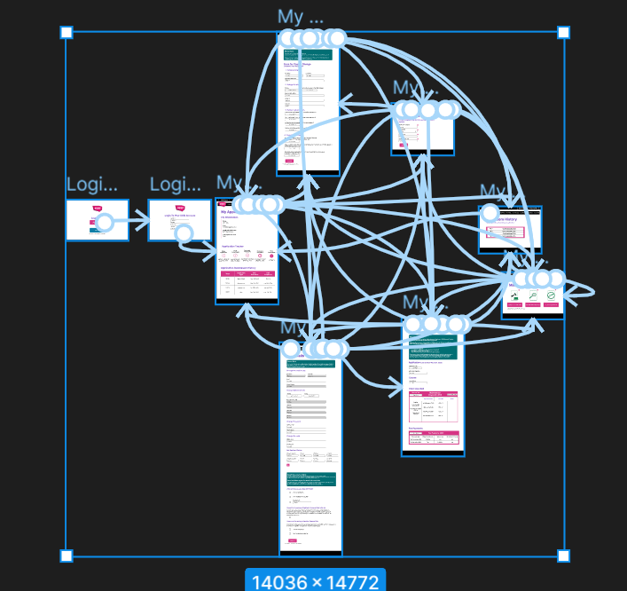
SUSI prototype screen connections
Addressing accessibility barriers in the SUSI application
This research and redesign project aimed to improve the SUSI student application experience for users encountering accessibility barriers. My analysis identified issues across mobile usability, readability, and colour contrast, alongside a number-based login process that created particular barriers for users with visual impairments, colour-vision deficiencies, and numeracy-related learning difficulties.
Redesign priorities centered on creating a more inclusive platform. This included clearer typography and larger text sizes, stronger colour contrast verified with WebAIM, simplified interactions, and the removal of inaccessible security steps. I also established consistent design system units for text, spacing, sizing, and colour. The goal was to create a clearer, more accessible, and more inclusive SUSI experience for students.
My approach to research and redesign
My methodology for this project encompassed a thorough range of UX research techniques
- UX audit: I assessed the current interface using Nielsen’s Ten Usability Heuristics, pinpointing issues with user control, navigation, login flow, and redundant interface elements.
- Accessibility analysis: The service was evaluated against WCAG 2.1 standards, supported by WebAIM Contrast Checker, identifying problems with colour contrast, text scaling, mobile responsiveness, missing labels, and assistive usability.
- Stakeholder mapping: This involved mapping relationships between SUSI management, government bodies, students, and parents to understand power, influence, and overall service impact.
- User personas and empathy maps: I developed personas representing users affected by visual accessibility barriers and numeracy-related learning difficulties, connecting technical issues to feelings of frustration, distrust, and anxiety.
- User testing: I conducted a round of user testing on the Version 1 prototype to gather feedback on usability, accessibility, navigation, and interaction clarity, which informed the development of the Version 2 prototype.
- Legal and policy context: I carefully considered the Disability Act 2005 and Ireland’s digital transformation goals to understand the broader risks associated with inaccessible public digital services.
SUSI UX Audit As A PDF
Connecting policy with practical design
A key part of this project was recognising that SUSI’s accessibility issues were not only usability problems, but potential service, reputational, and compliance risks.
Ireland’s Harnessing Digital Framework sets a target for 90% of public services to be available online by 2028, but this only works if digital services are inclusive and accessible to the people who rely on them.
My analysis found that SUSI’s current design created barriers for users with visual impairments and numeracy-related learning difficulties. These barriers raised concerns in relation to accessibility expectations, WCAG 2.1 AA standards, and the Disability Act 2005. If left unaddressed, these issues could create grounds for complaints to the Ombudsman, as well as reputational and internal risk for SUSI as a public student support service.
The redesign recommendations focused on three priorities: improving accessibility compliance, increasing clarity and user control, and creating a more responsive and flexible interface. This connected the project’s UX decisions to wider public service goals around inclusion, trust, and equitable access.
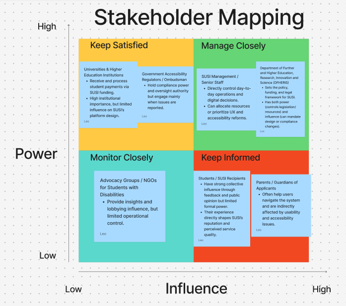
Stakeholder Mapping: When analyzing SUSI inside the context of digital transformation policy and accessibility law it was important to understand who the stakeholders were and how their involvement impacted the communication of this analysis and redesign
The reimagined SUSI prototype
The strongest outcome of this project was translating a detailed accessibility and UX analysis into a Version 2 prototype that reimagined the nine-page student-side SUSI service.
The prototype featured a redesigned flow, guiding users seamlessly from login choice, through the login form and homepage, and into the various student service pages. Users could navigate through redesigned sections including letters, banking details, course details, and other related student account pages. Although time constraints meant mobile responsive design was excluded from the submitted prototype, responsive reflow was highlighted as a key recommendation in the comprehensive analysis report.
The final outcome powerfully demonstrated how accessibility-led design decisions can create a clearer, more usable SUSI experience. This was achieved through improved typography, stronger contrast, simplified login steps, and a more consistent design system.
SUSI Prototype Demonstration